PANTONE COLOR OF THE YEAR
3/9/2021
Let's Start A Conversation:
2019 PANTONE COLOR OF THE YEAR: LIVING CORAL
If you’re looking for a color with hints of pink, but with added power, then Pantone’s 2019 Color of the Year, Living Coral, is an excellent choice. Living Coral has energetic elements of pink, orange, gold and red, absorbing the best parts of each. Like its namesake, this color automatically brings to mind peaceful afternoon walks at the beach and the feel of soothing sand under your feet.
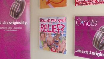
 Coral can be the perfect tool to give your
business an unforgettable marketing presence, thanks to its vibrant, warm and natural qualities. This unique hue gives print and digital media a
human touch, creating a real, one-on-one connection with customers.
What Living Coral Feels Like
With elements of both pink and orange, coral is filled to the brim with emotion. This color creates an ambience that is comforting and supportive. It represents passion and intimacy balanced with experience and determination. Above all, coral is honest and trustworthy. It’s the color of a person who deeply values friends.
Living Coral is also skillful at bridging the gender gap. It caters to people who love pink, both women and men, while providing the extra “bite” of orange.
Amazing Color Combinations
Living Coral reminds people of the ocean, so it pairs especially well with beach tones: sand colors, aquatic tones, faded yellows and darker blues. Coral adapts effortlessly to different design palettes, making it easy to highlight facets of orange or pink for increased intensity or softness respectively. Other possibilities include warm hues of white and gray, cream tones and bluish shades of purple.
HOW COLOR DRIVES PURCHASING INTENT
Does color really have the power to motivate people to purchase your products? Absolutely. Metrics reveal that as many as 93 percent of potential customers base their decision to buy a certain product on its appearance, and 85 percent mention color as the biggest motivating factor. Why is this?
Scientists have known that color affects people on a psychological level for quite awhile. The hues you choose for product branding, website design and marketing campaigns affect your customers in at least five ways:
1. Specific colors generate increased excitement
2. Colors determine how consumers view the product’s effectiveness
3. Contrasting hues allow your products to stand out from the crowd
4. A harmonious color theme tells a story that engages customers
5. Colors reach potential buyers on an emotional level
Our marketing experts understand what colors to use to transmit feelings of excitement, sophistication, caring, durability, professionalism and innovation, among many others.
THE EFFECTS OF COLOR ON BRAND IDENTITY
How can making good use of color improve your brand message specifically? Here are three important avenues where color is a huge help:
Brand personality: Every business wants people to see its strongest qualities. Making sure your core business values show through goes a long way towards being a brand that people feel automatically attracted to. Your choice of brand colors tells customers whether your business is primarily artistic, high-tech, trustworthy, friendly, playful or serious.
Brand recognition: Besides communicating your company’s message, branded color palettes make it easier for people to remember you. Seeing certain colors together instantly evokes your brand and makes people associate it with positive experiences.
Effective marketing: Great marketing isn’t just about presenting customers with a long list of benefits and statistics showing why your products are better. To motivate them to buy from you, it’s essential to stimulate emotions as well. If you can get people to imagine themselves using your product and feeling happier, purchasing intent follows automatically.
BUILD THE BEST 2019 MARKETING STRATEGY WITH LIVING CORAL
Living Coral is primed to be the biggest marketing trend in 2019, and for good reason. Modern consumers want more than information; they want a friendly, personalized experience and company interactions that feel like having a conversation with a real human.
You don’t need to have a PhD in psychology and color theory to make the most of color in your 2019 advertising plans. Work with our team of marketing experts at American Speedy – Marketing Print Mail to have access to all the know-how and state-of-the-art technology needed for unforgettable marketing. Contact us to get started.

Joe is passionate about helping SMBs. He’s spent the last 30+ years building the American Speedy Printing Marketing • Print • Mail brand – and sharing best practices and marketing trends with his customers. Through research, in-person visits and this blog, he hopes to engage with and empower local business owners and marketing professionals.
Sources:
https://www.huffpost.com/entry/10-reasons-to-love-coral_b_5724994
| Tweet |