4 Tips for Awesome Custom Window Graphics
9/24/2018
Let's Start A Conversation:

The name of the game in retail is to get people into your location and interest them in the goods or services you provide. Successful retailers know that starts with eye-catching, easy-to-understand signage, like custom window graphics.
With more than 82% of customers looking for local products and services online, and 90% of those then visiting a physical location, capturing people’s attention at the curb with a strong brand presence lets them know they came to the right place.
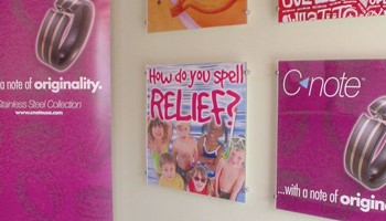
Custom window graphics do more than just convey your business name. They are often your first opportunity to inform, educate and advertise what you have to offer.
Think of your window graphics and other signage as silent salespeople. When done well, they announce sales and specials. They set expectations for the type of experience someone will have when they enter your location. They draw people in.
In fact, a study conducted by FedEx found that nearly eight in 10 (76%) people say they’ve gone into a store they’ve never visited before because its window graphics, signs or banners caught their attention. Additionally, three out of four consumers have told someone about a store based simply on its signage.
Conversely, poor signage can deter someone from entering a store. The same study found that more than half (52%) of respondents say they are less willing to enter a store if they spot misspelled or poorly-made signs.
So how do you make sure your window graphics get noticed?
- Size matters. Readability is imperative to drawing in casual passersby. The larger the letters and graphics, the easier they will be to read. A general guideline is to have at least one inch of letter height for each ten feet of distance from where someone will be reading your custom window graphic. If they are viewing your graphic from 100 feet away, letters should be at least 10 inches high.
- Less is more. Custom window graphics can’t tell your whole story, so don’t muddy your message with too many graphics or competing messages. Pick your strongest and most compelling message to share and then support that with continued messaging once people have entered your location.
- Create contrast. A sign’s contrast directly impacts its readability and retention. Using similar colors for the background and the lettering can decrease a sign’s readability. If the background is light, the writing should be dark, and the opposite works as well.
- Consider color. The colors you use are part of your brand message. Use colors that mirror or complement the look and feel of your place of business. With custom window graphics, also consider how much direct sunlight will be hitting the graphics, as they can fade over time, changing the impact of your signage.
Almost seven in 10 (68%) consumers have bought a product or service because a sign or banner caught their eye. When done well, custom window graphics are an affordable and easily changeable way to encourage people to visit your location instead of your competitor’s.
Need assistance creating and designing your custom window graphics or other signage? Let us know; we can help.
| Tweet |